Projects

Android Development
Drink Tracker
HCI Design
Tiny Typing
HCI Research
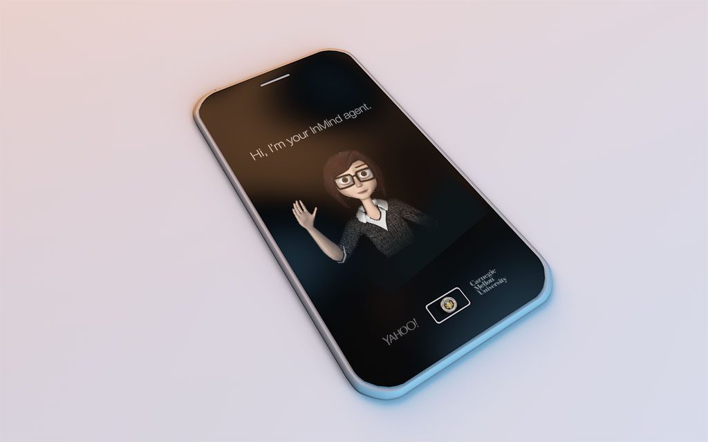
InMind
Software Development
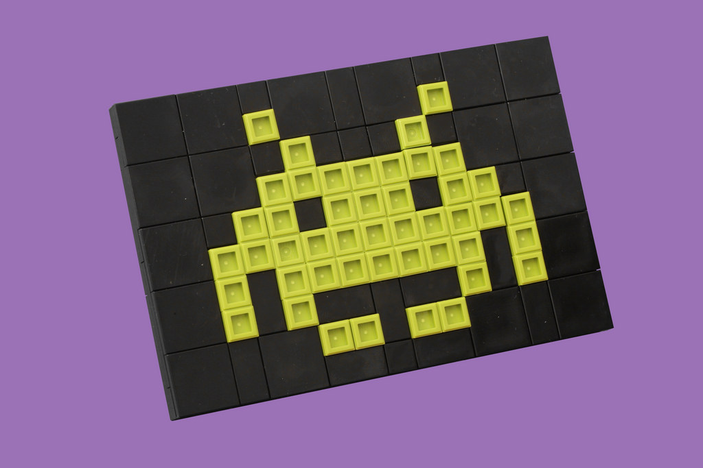
Galaxy Defenders
Drink Tracker
Tiny Typing
InMind
Galaxy Defenders
An app to help keep track of drinks and raise awareness for alcohol overconsumption.
Andy Shen & Chris Cheung
Background
This winter break, I wanted to work on a personal project in a domain that I didn't have previous experience in ― mobile development. After thinking about an app idea that would be useful to teenagers and young adults, my friend Chris and I decided to create an android app that allows users to keep track of their blood alcohol content (BAC) when they consume alcoholic beverages: DrinkTracker.
Purpose
DrinkTracker's main purpose is to let users, particularly younger adults who don't know their alcohol limits, visualize their current state with each drink they consume. After a user inputs his or her name, weight and gener, he or she can add to their list of drinks everytime an alcoholic beverage is consumed and the BAC level is displayed on the home screen.
Tech Stack
We wrote the majority of the logic for the app using Java, along with a SQLite database for the backend to store the alcohol information. For the front-end and UI, we used XML in Android Studio.
Key Design Decision
One of the biggest decisions we had to make was whether we wanted to write a webscraper to scrape for alcohol information on request when a user adds a drink. This would allow us to retrieve information on any drink in the market, but would require extra processing during runtime. An alternative would be to scrape the web beforehand and dump the data in a database as a one time operation. While the runtime would be faster, this would limit us if there were an alcohol that wasn't available in the database. We decided to implement the latter, scraping the information from http://getdrunknotfat.com/ once and storing the alcohol name and percentage alcohol by volume as a key-value pair so that runtime access would be constant.
Features in the Future
Text entry design for smartwatches.
Andy Shen & Diana Li & Renhao Hu
Background
As the shift to mobile and wearable technologies begins to surface, there is an increasing amount of importance in having a good design for user input. While phone screens may provide enough space for users to type into a keyboard, smartwatches don't have enough space to support a traditional keyboard for users to tap on. We explored this issue by developing an app for touchscreen smartphones to simulate a smartwatch and creating different designs for user input.
This project was an assignment for Designing Human-Centered Software, a HCI course at Carnegie Mellon University that teaches fundamental concepts in designing, prototyping, and evaluating user interfaces.
Requirements
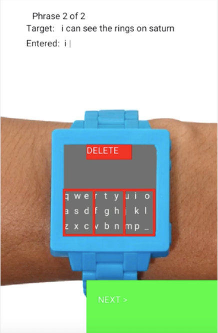
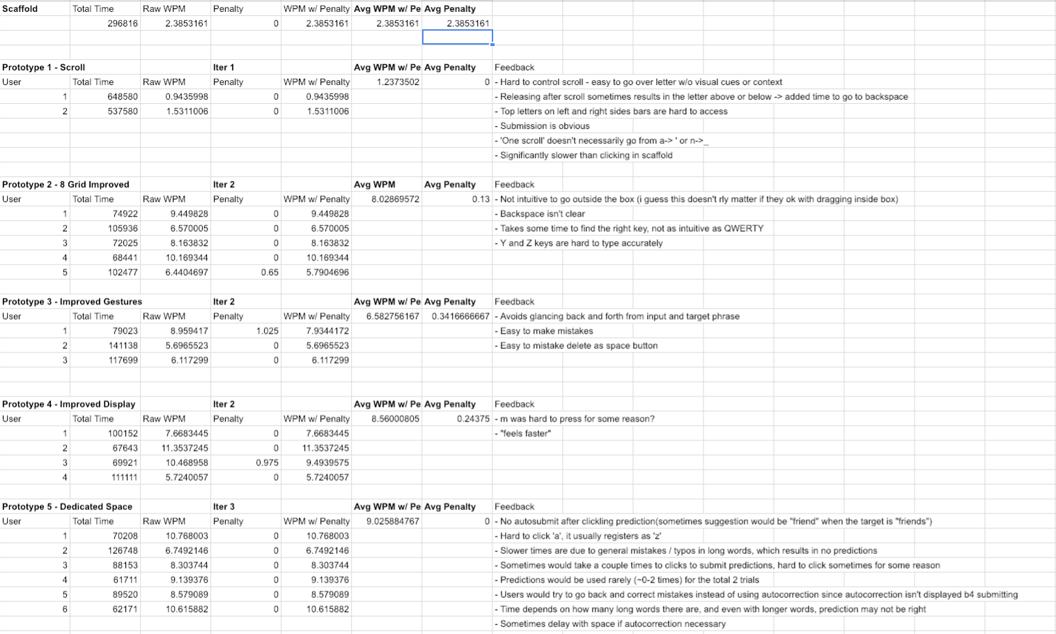
Trial Information
Each trial consisted of two randomly generated sentences pulled from a corpus that we would have to type (similar to typeracer). When we finished typing the first sentence, we hit the next button and enter the second sentence. After we submitted the second sentence, out speed (words per minute) would be outputted with additional penalties for words that were misspelled. The wpm with penalty was what we used to benchmark the speed of each of our prototypes.
Tech Stack
The app was created using Processing, an open source graphical library and IDE built for visual design. It uses the Java language with various simplifications. The apps were then run on android phones.
Starting Point
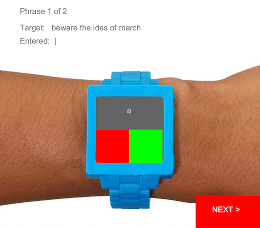
We were initially given scaffold code that contained a design with the current letter on the top half of the screen and a red button to move backwards a letter and a green button to move forwards a letter. To submit the letter, the user clicks on the current letter.
Some of the biggest observations we made with this design were the simplicity and the number of clicks required to submit a letter. While this design was extremely simple and intuitive, it takes around 13 clicks in order to find each letter in the worst case. Since wpm is correlated with number of clicks, we wanted to create a design that would maintain the simplicity but reduce the number of clicks required to get to each letter.
After testing the scaffold code, we found that we could achieve roughly 2.4 wpm with that design.
Brainstorming
To start off, we began by brainstorming a couple of possible designs we wanted to explore. Some features that we thought we could potentially have in our design included autocompletion suggestions, handwriting recognition, and autocorrecting misspelled words to improve our wpm and decrease our error penalty.
Design 1
Our first idea was to have the keys lined up on the border of the smartwatch and the user would select a letter by sliding their finger towards the edge of the watch at that letter. The delete key would be located at the bottom left of the screen and the space key would be at the bottom right. The user confirms the input by tapping on the middle of the screen. This experimental design was inspired by the fact that we wanted to utilize the entirety of the space that we had available to work with.
Design 2
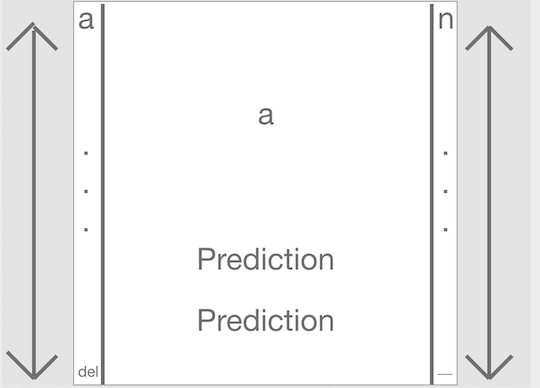
Our second idea was to have the keys lined up on the left and right edges of the watch. The first 13 letters of the alphabet and the delete key would be on the left side while the last 13 letters and the space key would be on the right. The user would select a letter by sliding their finger towards up and down the side of the watch. The middle of the screen would then contain suggestions for words that the user may be typing. We came up with this concept when we thought about the switches on analog watches and wanted to see if we could incorporate them into our design.
Design 3
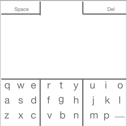
Our third idea was closer to a traditional qwerty layout. The keyboard layout is the same as a regular keyboard except the p is moved to the third row because of spacing issues. We then separated the keys into groups of three. When a user taps into one of the three grids, swiping in the direction of the letter will result in that letter being output. For example, if a user taps in the middle grid and swipes up, a t will output. We also moved the space and delete keys to the top of the screen. While this design doesn't bring any drastic changes to the table, we wanted to see how effective a more traditional keyboard layout would do on a smartwatch interface.
Prototyping Process
Once we had our design ideas, we created prototypes and performed user testing on each iteration. In total, we created 5 prototypes. We ended up not implementing the first design because the screen wasn't big enough to fit the number of letters that we drew out in our design. The different prototypes can be seen here:
Testing Results
Takeaways
Researching Rapport-Building AI Personal Assistants
Background
This year, I had the opportunity to join the Articulab, a research group at Carnegie Mellon University that focuses on studying how people communicate with technology. Within the Articulab, I worked as a research intern on the InMind project, researching how we can use the concept of episodic memory to build rapport between humans and AI personal assistants.
Contributions
During my time at the Articulab, I worked on two main tasks. In my first semester, I wrote a literature review on existing works for conversational agents with long term memory. I then designed an episodic memory architecture for conversational agents to store memory episodes using the information I learned from the literature. My second semester was focused on the implementation of an episodic memory component for a personal assistant. For confidentiality reasons, I can't go into detail about specifics of the design or implementation of the component.
Takeaways
This was my first time doing research and I think it was a wonderful experience. I didn't have much experience with topics related to Human-Computer Interaction before joining the Articulab so I wasn't sure what to expect. After doing research, I've become more interested in learning about how humans interact with technology and seeing how technology can further enhance how people live in society.
A spinoff of the retro arcade game Space Invaders
Background
This project was my term project for Fundamentals of Programming, an introductory computer science course at Carnegie Mellon University that teaches fundamental of programming with emphasis on producing clear code using top-down design, informal analysis, and effective testing and debussing.
Tech Stack
I created the game in Python, along with Pygame, a cross-platform set of Python modules that contains computer graphics and sound libraries for Python.
Game Rules
The main objective of the game is to progress through the first four levels by defeating enemies and then beating the boss on the fifth level. The player defeats enemies by shooting bullets at the enemies. If the player gets hit by an enemy or by an enemy bullet, the player loses a life. The game ends once the player has 0 lives left or the player defeats the boss.
Game Features
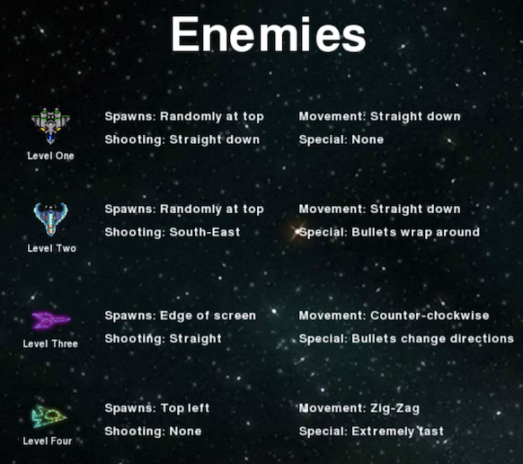
There are four different types of basic enemies that show up as the player progresses through the game. Each of them have different movement patterns and abilities depending on what type of enemy it is.
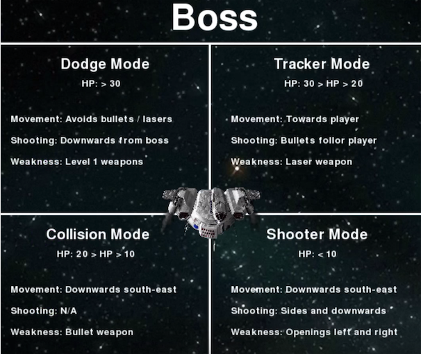
Once the player reaches level five, the final boss appears. Depending on the amount of health the boss currently has, it will be in a different mode. The different modes include:
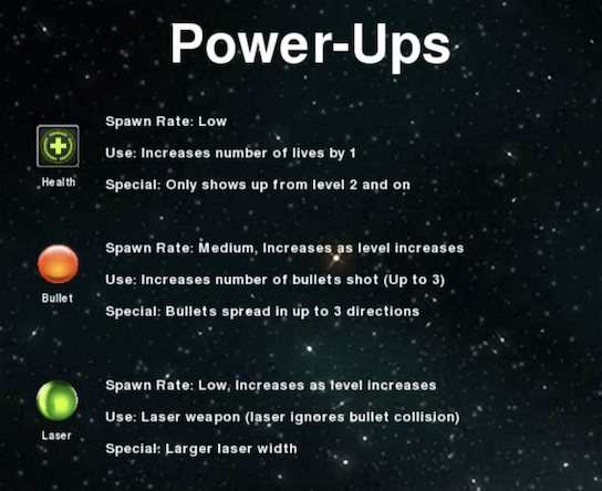
Throughout the duration of the game, powerups may randomly fall from the screen. The two different categories of powers are weapon upgrades and health packs. Weapon upgrades can allow the player to fire multiple bullets or switch weapons to a laser that ignores bullet collision with enemy bullets. Health packs restore one health to the player.
Potential Add-on Features for the Future
Takeaways